Some titles feel plain at first glance. Others spark curiosity before the first line is read.
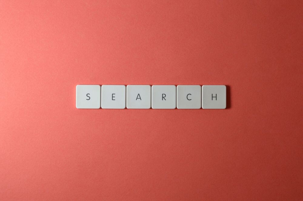
1. Bold Title Cards That Pull the Eye
A bold title card can look like a bright sign in a quiet room. Clean shapes, strong color, and clear type make it easy to notice right away.
This style helps readers know what the page is about fast, which saves time and builds trust. A simple layout often costs less to make, and it works well on phones, tablets, and large screens. For a personal touch, try warm colors for a friendly mood or sharp contrast for a more modern feel.
2. Soft Serif Titles for a Calm, Classic Feel
Soft serif titles bring a book-like charm that feels warm and thoughtful. The small strokes on the letters give the design a gentle look without trying too hard.
Many people like this style because it feels elegant and easy to read. It can work well for blogs, guides, and brand pages that want a polished touch. If you want it to feel more personal, pair it with a simple photo or a favorite accent color.
Cost stays low when you use free fonts and a plain background. This look is also on trend because many readers enjoy calm designs that do not shout for attention. A good tip is to keep the font size big enough so the title still feels open and friendly.
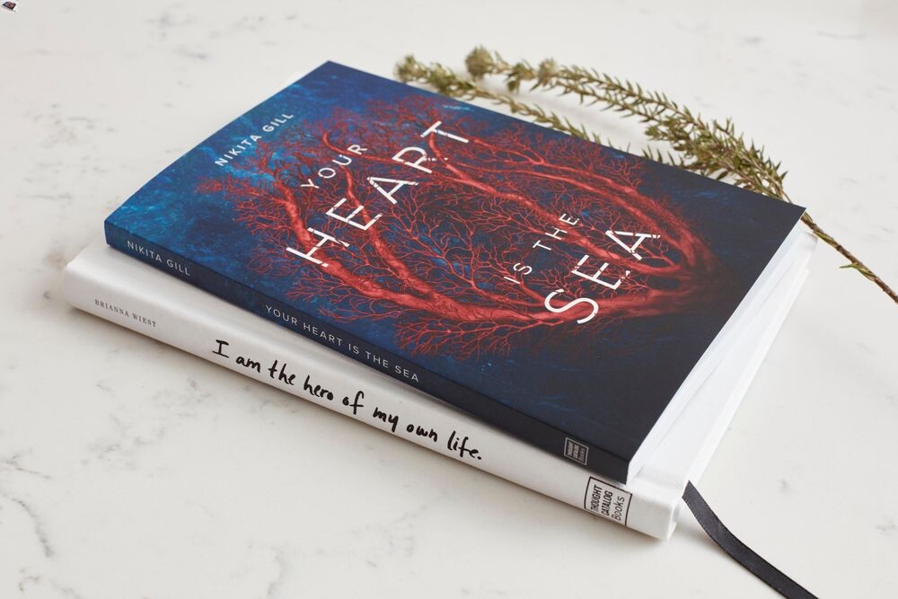
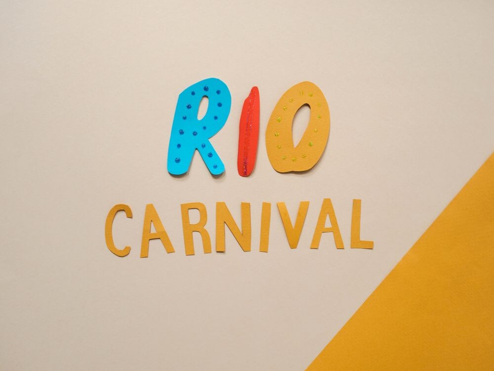
3. Playful Handwritten Titles That Feel Personal

Handwritten titles can feel like a note from a friend. They bring a human touch that makes the page seem less stiff and more welcoming.
These titles work well for crafts, kids’ topics, food posts, and personal stories. They stand out because they feel unique, and that can help a page feel special right away. To keep them easy to read, use them with simple body text and enough space around the words.
If you want to keep costs down, many handwritten fonts are free or low-priced. You can also make the title feel more personal by matching it with a soft color, a doodle, or a small icon. A current trend is mixing handwritten text with neat layouts, which gives a fun but tidy look.
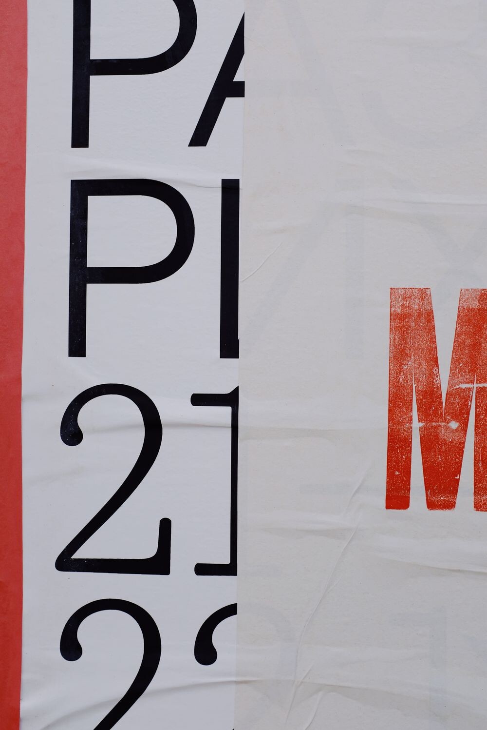
4. Large Centered Titles for Strong First Impressions

Large centered titles make a page feel important the moment it opens. The eye goes straight to the middle, so the message feels clear and steady.
This style can help readers focus, which is useful for landing pages and feature articles. It also looks clean on many screen sizes, so it is a safe choice for modern design. If you want more personality, add a short subtitle or a soft image behind the text.
5. Split-Line Titles That Add Energy

Split-line titles break a phrase into neat parts, and that can make the page feel lively. The layout creates movement without needing extra decoration.
This style is useful when you want a title to feel fresh and easy to scan. It can also help long titles look less crowded, which is nice for small screens. For a custom touch, try placing one line in a bold color and the other in a softer shade.
Costs stay friendly because the design uses simple spacing instead of fancy art. Current trends often favor this kind of clean, graphic look because it feels modern and easy to share. A smart tip is to keep the line breaks balanced so the title feels neat, not chopped up.
6. Dark Mode Titles with Bright Contrast
Dark mode titles have a sleek look that feels modern and a little dramatic. Bright letters on a dark background can feel crisp, like lights on at night.
Readers often enjoy this style because it is easy on the eyes in low light. It can also make colors pop, which helps important words stand out. If you want a personal touch, use one accent color that matches your mood or brand.
This look may cost very little if you use a simple dark background and one strong font. It is also popular in current web design because many people like darker screens for comfort. A useful tip is to test the contrast so the title stays clear and readable.
7. Minimal Titles with Plenty of Space
Minimal titles feel open, calm, and neat. They use space like part of the design, which makes the words breathe.
This style can be great for readers who want a clean path to the main idea. It also makes the page feel more polished without adding extra clutter. For a unique twist, use one small line, one bold word, or a tiny symbol next to the title.
Minimal design often keeps costs low because it needs fewer elements. It is also a strong trend in modern layouts since many people like simple pages that load fast. To make it feel more personal, choose a font that matches your voice, from soft and friendly to sharp and bold.
8. Color-Blocked Titles That Feel Fresh
Color-blocked titles use bright sections to frame the words. The result can look cheerful, neat, and full of energy.
This style helps readers spot the title fast, which is useful when a page has lots of content. It also gives a strong visual shape that can make the whole layout feel more exciting. If you want it to feel more your own, pick colors that match your theme, hobby, or brand style.
Cost can stay low because the effect comes from simple blocks, not heavy artwork. Many current designs use bold color pairs because they feel lively on social media and websites. A good tip is to keep the text easy to read by choosing colors with enough contrast.
9. Storybook Titles with a Whimsical Mood
Storybook titles can feel like they belong on the first page of a favorite tale. Curved letters, soft shadows, and gentle decoration give them a magical look.
These titles are helpful for kids’ content, creative writing, and dreamy brands. They stand out because they feel different from plain text, and that can make a page more memorable. If you want a personal touch, add little stars, leaves, or hand-drawn details around the words.
They do not need to cost much if you use simple art and free fonts. A current trend is using playful title styles with clean backgrounds so the design feels fun but not messy. To keep it practical, make sure the title still reads well at a quick glance.
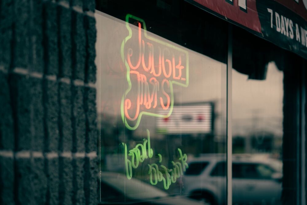
10. Neon Titles for a High-Energy Look
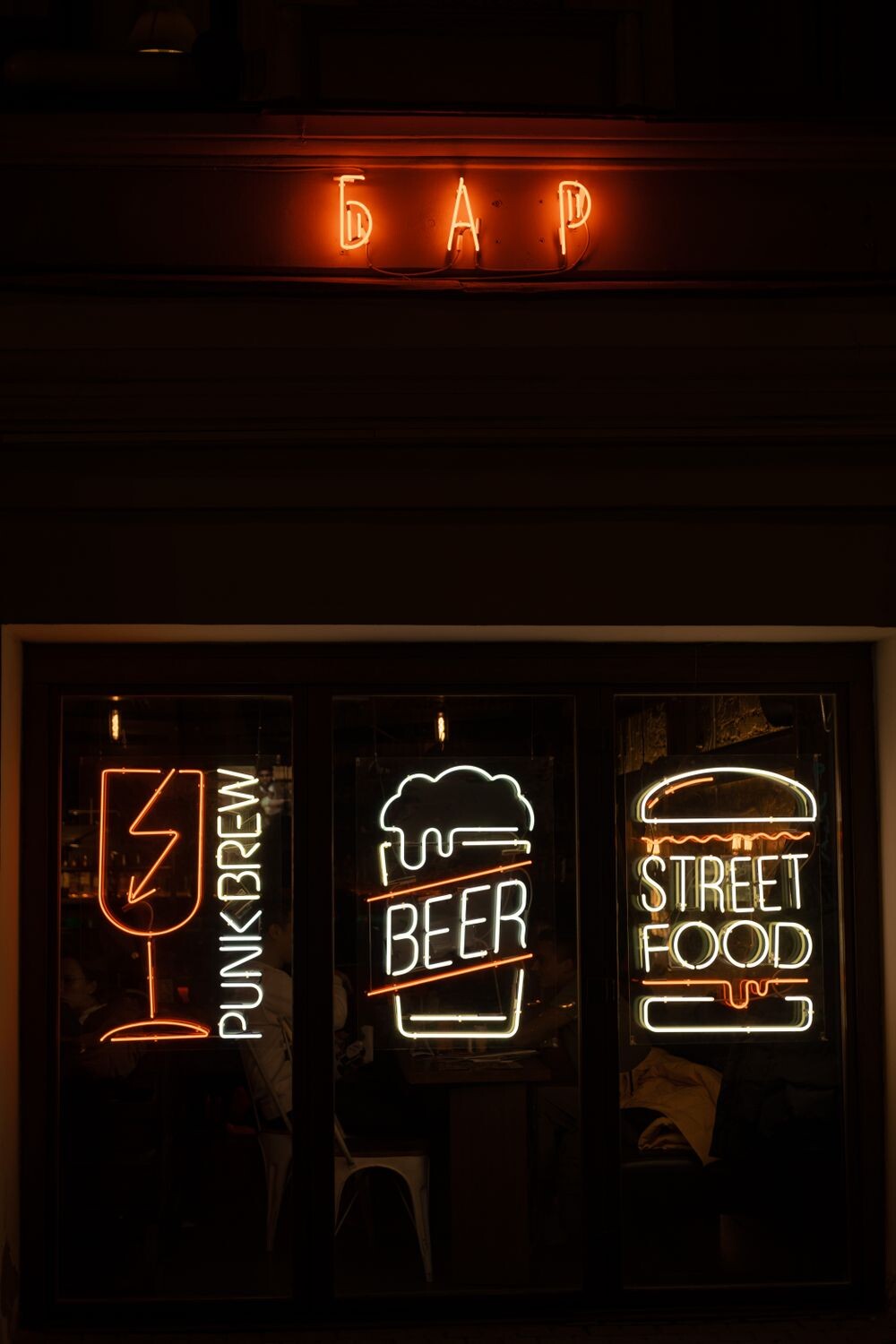
Neon titles glow with bold color and strong attitude. They can make a page feel lively, modern, and full of motion.
This style is great for music, events, games, and trend-focused content. It grabs attention fast, which can help readers stay interested. To make it feel more personal, choose a neon shade that matches the mood you want, like electric blue, hot pink, or bright green.
Costs can vary if you use special effects, but a simple neon look can still be affordable. Current trends often mix neon with dark backgrounds for a sharp, eye-catching style. A helpful tip is to keep the glow soft enough so the words do not become hard to read.
11. Nature-Inspired Titles with Leafy Details
Nature-inspired titles often feel calm and fresh, like a walk outside on a clear day. Leaf shapes, soft greens, and earthy tones can make the page feel grounded.
This style works well for wellness, gardening, eco-friendly brands, and outdoor topics. It gives a gentle visual message that can make readers feel relaxed and welcome. For a personal touch, use colors from your favorite season or add a tiny flower or branch detail.
Many nature looks are budget-friendly because they rely on simple shapes and natural colors. They are also popular now as more people like honest, simple design with a soft feel. A good suggestion is to keep the title clean so the natural details support the words instead of hiding them.
12. Metallic Titles That Feel Polished
Metallic titles shine with a sleek finish that can feel rich and modern. Silver, gold, and bronze tones add a little drama without needing a busy layout.
This style can make a title feel special right away, which is useful for premium products or event pages. It also gives a strong visual edge that may help a page stand out in a crowded feed. If you want a custom look, match the metal tone with a deep color like navy, black, or forest green.
Costs may rise if you add detailed effects, but a simple metallic font can still be affordable. Current trends often use subtle shine instead of heavy glitter, which keeps the design classy. A smart tip is to use this style in small doses so it feels elegant, not flashy.
13. Rounded Titles That Feel Friendly

Rounded titles have soft edges that make them feel warm and easy to approach. The shape of the letters can almost smile at the reader.
This style is a good fit for family content, apps, casual brands, and welcoming home pages. It helps create a kind mood, which can make people stay a little longer. To personalize it, choose a bright color for a playful feel or a muted tone for a calm one.
Rounded fonts are often easy to find at low cost, and many are free. They fit current trends because simple, happy shapes feel fresh and easy to trust. For the best result, pair them with open spacing so the title stays smooth and clear.
14. Vintage Titles with Old-School Charm
Vintage titles can bring back the feeling of old posters, signs, and classic books. They often use bold shapes, textured looks, or retro serif styles.
This design can be useful when you want a title to feel timeless and full of character. It stands out because it carries a story even before the reader starts reading. For a personal touch, use a color palette that reminds you of a favorite era or family keepsake.
Costs can stay low if you use simple textures and free retro fonts. This style is also trending in many creative spaces because people enjoy designs that feel warm and familiar. A helpful tip is to keep the rest of the page simple so the vintage title can shine.
15. Animated Titles That Bring Motion

Animated titles can feel alive the moment they appear on screen. A small movement, fade, or slide can make the words feel more exciting.
This style is useful for websites, presentations, and digital ads because motion can guide the eye. It can also help a page feel more modern and memorable. If you want it to feel personal, keep the motion gentle and match it to the mood of your content.
Costs depend on how complex the animation is, but simple motion can be done without a big budget. Current trends lean toward smooth, light animation instead of flashy effects that distract. A good suggestion is to make sure the title still loads quickly and stays easy to read.
16. High-Contrast Titles for Clear Reading
High-contrast titles use strong differences in color so the words stand out fast. Black and white is a classic example, but many other sharp pairs work too.
This style helps readers with quick scanning, which is useful on busy pages. It also gives the design a bold, confident feel that can make the message stronger. To make it more personal, choose a contrast pair that matches your brand or your favorite color mood.
It is often one of the cheapest styles to use because it needs little extra decoration. Current design trends still favor strong contrast because it works well on small screens and in bright light. A useful tip is to check the title from far away and up close to be sure it stays readable.
17. Brush-Style Titles with Artistic Flair
Brush-style titles look like they were painted by hand, which gives them a lively, creative feel. The strokes often feel bold and loose, like quick art on paper.
This style can work well for fashion, art, food, and personal brands. It adds personality in a way that feels energetic and real. If you want a unique touch, use a brush font with a small splash of color or a paint-like underline.
Costs can be low if you use a ready-made brush font instead of custom art. This look stays popular because people enjoy designs that feel human and expressive. A good suggestion is to keep the rest of the layout simple so the brush title does not fight for attention.
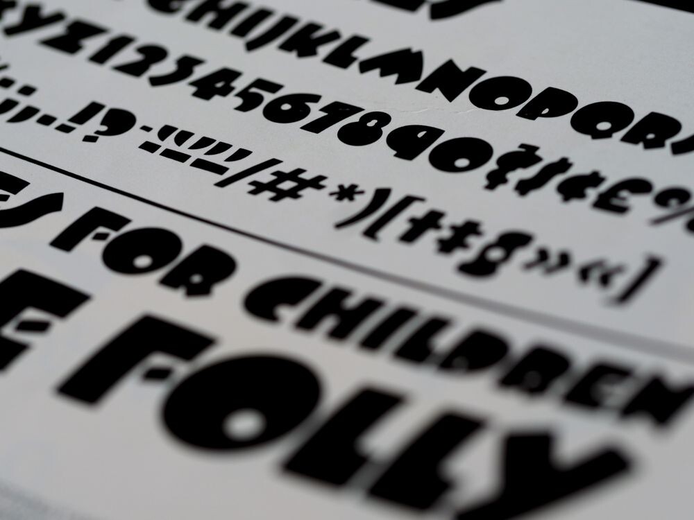
18. Geometric Titles for a Sharp, Modern Edge
Geometric titles use clean shapes and straight lines, which gives them a neat, smart look. They can feel modern, tidy, and full of purpose.
This style is helpful for tech topics, business pages, and design-forward brands. It makes the title feel organized, which can build confidence in the reader. For a personal touch, use one accent shape like a square, circle, or line to frame the words.
Many geometric fonts are affordable or free, so the style can fit a small budget. It is also a current trend because simple shapes feel fresh and easy to use across devices. A practical tip is to leave enough room around the letters so the shape stays crisp.
19. Shadowed Titles That Add Depth
Shadowed titles create a sense of depth, almost like the words are floating above the page. This can make the title feel stronger and more present.
The effect helps important words stand out, which is useful when the page has a lot going on. It can also make a flat layout feel more lively without adding too many extra parts. If you want a personal touch, try a soft shadow for a gentle look or a sharper one for more punch.
Costs stay friendly when the shadow is simple and built into standard design tools. Current trends often use subtle depth instead of heavy 3D effects, which keeps things clean. A helpful tip is to keep the shadow light enough that the title remains easy to read.
20. Asymmetrical Titles That Break the Rules

Asymmetrical titles do not sit in perfect balance, and that is part of their charm. The off-center feel can make a page look bold and fresh.
This style is useful when you want the title to feel artistic or unexpected. It can also guide the eye in a new way, which makes the layout feel more exciting. For a personal touch, shift the title slightly, add a side note, or pair it with an angled image.
It does not need to cost much, since the effect comes from placement rather than extra decoration. Current design trends often use this kind of playful imbalance to make pages feel modern. A smart suggestion is to keep the words readable even if the layout feels a little daring.
21. Layered Titles with Overlapping Shapes
Layered titles use overlapping pieces to create a rich, full look. The design can feel like paper cutouts stacked in a neat and clever way.
This style helps a title feel more special and memorable, which is useful for posters and feature pages. It can also make simple words look more creative without changing the message. If you want it to feel personal, use shapes or colors that reflect your style, hobby, or favorite place.
Costs depend on how detailed the layers are, but simple layers can stay affordable. This look is on trend because it gives depth while still feeling clean and modern. A good tip is to keep the overlap tidy so the title does not become hard to read.
22. Monogram Titles for a Smart, Simple Mark

Monogram titles use letters in a compact and stylish way. They can feel neat, classic, and easy to remember.
This style is helpful for brands, clubs, and personal projects that want a strong mark. It works well when the title needs to fit into a small space but still feel important. To make it more personal, choose letter shapes that match your tone, from elegant to playful.
Many monogram designs are low-cost because they use only a few letters and simple shapes. They remain popular in current design because they look clean on labels, icons, and profile images. A useful suggestion is to test the monogram at small sizes so it stays clear.
23. Title Banners with a Poster Feel
Title banners bring a bold poster look that can feel exciting right away. They often use strong rectangles, ribbons, or angled strips behind the words.
This style is useful for announcements, sales, events, and featured content. It gives the title a clear frame, which can make the message easy to spot. For a personal touch, choose a banner shape that fits your mood, like a soft ribbon or a sharp-edged strip.
Costs can be low because banners are simple to build with basic design tools. Current trends often use flat banner shapes with bright colors and clean type. A helpful tip is to keep the banner wide enough so the words do not feel squeezed.
24. Transparent Titles Over Photos
Transparent titles over photos can look modern and stylish when done well. The image behind the words adds mood, while the title still stays in charge.
This style helps a page feel richer because the photo and text work together. It can be great for travel, lifestyle, and brand pages that want a more visual feel. If you want a personal touch, use a photo that means something to you, such as a favorite place or object.
Costs may stay low if you use your own photos or free images. This look is very current because many websites and social posts use image-led design. A good suggestion is to place the title where the background is calm, so the words remain easy to read.
25. Tiny Caps Titles for a Quiet, Confident Style

Tiny caps titles use small capital letters that feel neat and controlled. They can make a page look polished without being loud.
This style works well for labels, section headers, and refined brand pages. It gives the words a steady voice that can feel calm and sure. To personalize it, pair tiny caps with a bold accent word or a soft color that fits your theme.
Costs stay low because the look depends on font choice more than extra art. It is also a current favorite in clean design because it feels modern and easy to scan. A useful tip is to add enough spacing between letters so the title does not feel crowded.
26. Irregular Titles That Feel Handcrafted
Irregular titles can look handmade in a good way, with small shifts that make them feel alive. The uneven feel adds charm and keeps the design from seeming too stiff.
This style is useful for creative projects, craft pages, and brands that want a warm, human voice. It can make the title feel unique because it does not follow a strict pattern. If you want it to feel more personal, use textures, imperfect lines, or a favorite color set from your own space.
These titles can be budget-friendly because the handcrafted look often comes from simple choices. Current trends like designs that feel real and not overly polished, which makes this style a strong fit. A good suggestion is to keep the irregular parts gentle so the title still feels easy to read.
27. Futuristic Titles with a Clean Tech Mood
Futuristic titles often use sharp lines, sleek fonts, and cool tones. They can make a page feel fast, smart, and ready for the next big thing.
This style is a good fit for tech, science, gaming, and modern product pages. It gives the title a strong edge that can help it stand out in a crowded space. To personalize it, choose a color glow or shape that matches your project’s style.
Costs can vary, but a clean futuristic look does not need to be expensive. Current trends often mix simple tech fonts with smooth gradients and dark backgrounds. A practical tip is to keep the title short and clear so the style feels sharp instead of busy.
28. Friendly Bubble Titles for a Fun Mood

Bubble titles feel soft, round, and full of cheer. The letter shapes can make the page seem playful and easy to enjoy.
This style works well for kids’ content, casual brands, and anything that wants a happy tone. It can help readers feel relaxed because the design looks friendly right away. If you want a personal touch, use bright colors or a small pattern that matches the topic.
Many bubble fonts are free or low-cost, so the style can fit simple budgets. Current trends often use round, soft shapes because they feel warm on screens. A good suggestion is to keep the rest of the layout simple so the bubble title stays the star.
29. Elegant Script Titles for a Fancy Touch
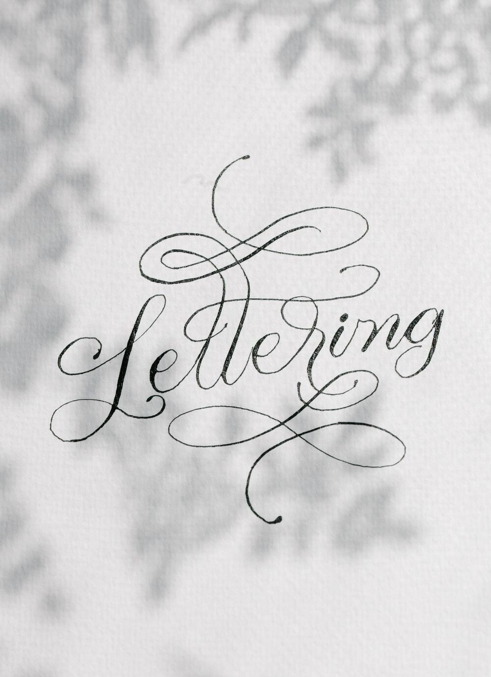
Elegant script titles can feel smooth and graceful, like handwriting from a special card. The flowing letters add a gentle sense of beauty.
This style is often used for weddings, beauty pages, and refined brands. It can make a title feel special without needing a lot of extra decoration. For a personal touch, match the script with a soft background or a favorite metallic accent.
Costs may stay low if you use a ready-made script font instead of custom lettering. This style remains popular because it brings warmth and charm to digital and print designs. A useful tip is to keep script titles short so the letters stay clear and elegant.
30. Mixed-Font Titles That Feel Creative and Bold
Mixed-font titles combine different letter styles in one line, which can create a lively look. The contrast makes the words feel playful and full of energy.
This style is useful when you want one part of the title to shout and another part to support it. It can help guide the eye and make the message easier to remember. To make it personal, mix a bold font with a softer one that fits your voice.
Costs can be low because you only need a few fonts and a simple layout. Current trends often use mixed type to make headlines feel more human and less flat. A smart suggestion is to keep the mix balanced so the title feels fun, not messy.